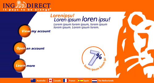
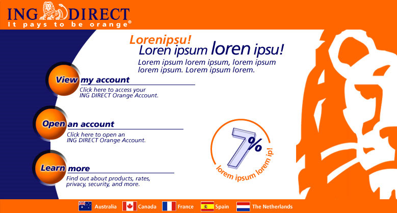
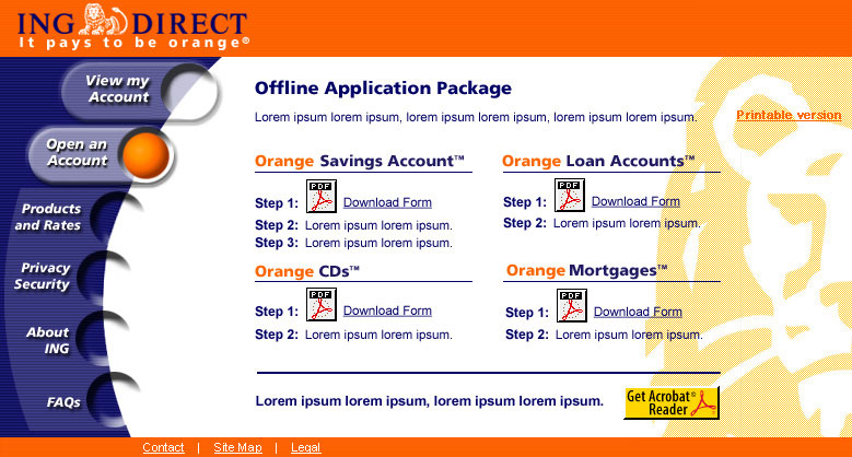
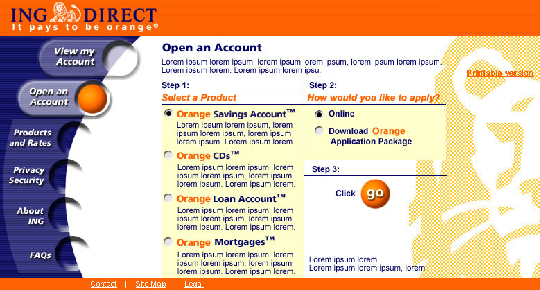
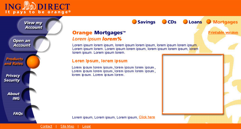
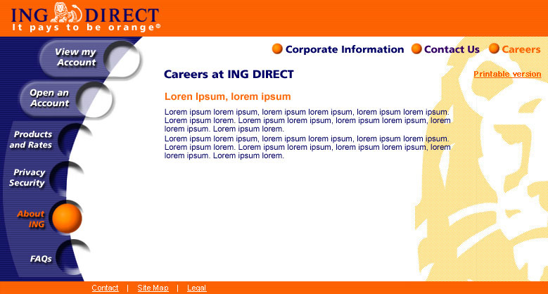
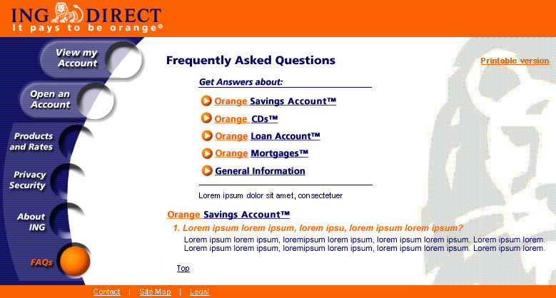
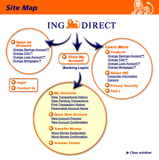
Origional direction from client was that he wanted to make his site different from other banking sites - he wanted it to be fun. To accomplish this, I worked with IA to define what the end user would be looking for when they arrived at the home page, allowing us to weight the importance of content on the page and also to simplify the architecture and the design. The color orange and the orange ball were the clients "brand". The orange ball became used as the "I am here" button and the interactive link to all consumer relevant content. It even followed through to the site map design. The Orange color, although not an basic html color, was combined with the background to achieve the color of the brand.
The "Lions Head" graphic was removed from the current site prior to coding as it was in conflict with the Dreyfus Corporation.
View Account Sign in Page |
